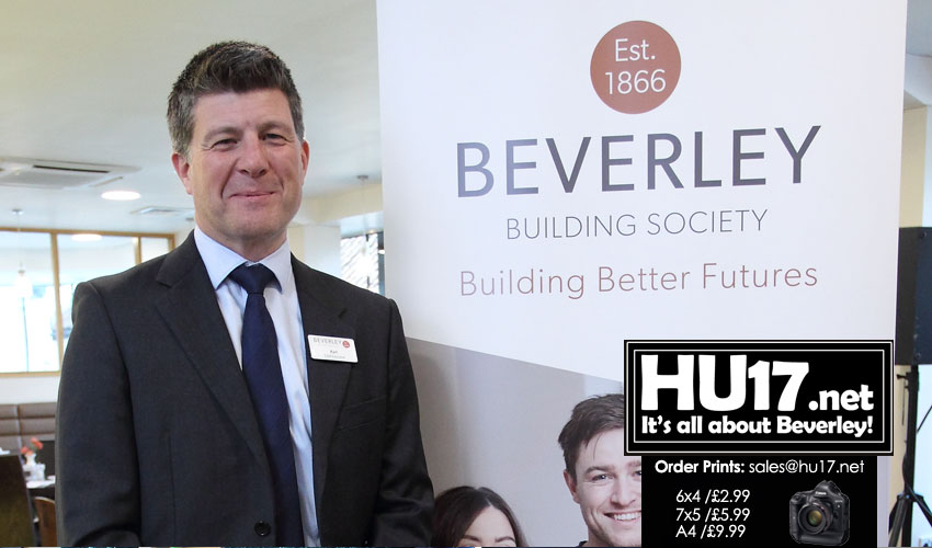
Beverley Building Society has unveiled its new branding. It has been designed to balance a more modern, fresh look with reflecting its rich heritage as one of the UK’s first building societies.
Featuring heritage colours such as bronze, dark and light grey, and cream, the Society’s new logo sports a circular date stamp given its long standing.
It also incorporates the new strapline ‘Building Better Futures’. This is in reflection of the Beverley’s founding purpose of helping ordinary people to own their own homes.
The new branding was announced to members in a freshly-designed AGM magazine and is being implemented gradually.
First things members will notice will be new stationery in-branch displays, a new photography style and updated website. Following shortly will be a new website and, in the next few months, a refit of the Society’s branch and head office.

Society Chief Executive Karl Elliott said;
“Our existing branding had become dated and we saw the opportunity to modernise the look and feel.”
“We’ve witnessed the transition from horse-drawn carts to motor cars. We have also withstood two world wars and several recessions, including the most serious ever global financial crisis.”
“During all that time, we’ve remained financially strong by focusing on lending to borrowers the funds our savers invest with us and offering both groups a way of realising some of their financial ambitions.”
He added: “Not everything will change overnight as we have decided to implement the changes bit by bit. This in order to minimise wastage and take the time to get things right.”
The inspiration for the Beverley’s new look was ‘cool heritage’ and it researched how other brands loved by its members present themselves.
New Look Reflects Ongoing Commitment
Karl added;
“We know that what our customers value most about the Beverley, is the quality, personal service we offer.”
“Our new branding reflects our ongoing commitment to maintaining that. Our drive to ensure that dealing with us remains as comfortable as visiting their favourite coffee shop.”
To make sure it struck the right balance, the Society started by asking our members what they thought.
Their main feedback was: ‘We love your new look, so long as you don’t change a thing about how you do what you do, and the personal touch we love so much.’
Members also said that the Society’s rich heritage and stability as a financial institution that has stood the test of time is hugely important to them. Hence why the Society’s date of establishment is so strongly highlighted in the new logo.
New Branding Revealed By Beverley Building Society Just The Tip Of The Iceberg
According to Karl, the branding is just the tip of the iceberg, he added;
“The branding symbolises everything we stand for and the process of creating it has involved thinking about how we can remain relevant for the next 10 years.”
“As a mutual, we were established to help ordinary people buy their own homes when that wasn’t financially possible.”
“We continue to reflect that social purpose through our mortgage lending but are also keen to look at new ways of meeting the needs of people in our East Yorkshire heartland and beyond, by working on things like a new community giving strategy in the year ahead.”
“Beverley Building Society is entering an exciting new era.”
Member Dawn Overton said;
“It’s great. The brand is ready for an update and I love the colours the Society has chosen.”
“They reflect the quality but are modern, warm and vibrant too. The reference to the founding date is very important because knowing the Society has stood the test of time.”

 Football for Good – How the Beautiful Game Is Making a Difference
 Why Managing Your Household Finances as a Couple is Key
 Smart Property Management: Strategies For Success
 Spotlight On Lifelong Learning: How Advanced Education Is Shaping Beverley’s Professionals
 Must-See Attractions in and Around Beverley


